

Today we are launching a new design for the wxrks platform. It is our first full redesign since 2022, and it replaces the interface most of you have worked in every day for four years.
We did not rush it. We spent months on research into how the best working software handles attention, and in long conversations about one question. Could the design we had carry what comes next, more tools connected to the platform, more AI inside the editor, more people on more screens, without getting louder every time we added something? The answer was no. So we rebuilt the foundation.
Why now
Since 2022 the platform has grown a lot. These are some of the biggest additions.
- Model management. Choose which AI model does which job, connect your own AI providers, and see token usage by feature and by organizational unit, with a forecast for the month.
- Continuous projects. One project that stays open for as long as the content lives. Re-import the file whenever it changes and only what changed becomes work. Built for app strings, website copy, and help center articles.
- Work packages. Send a whole project from one wxrks account to another. The translation memory and glossary travel with it, so the agency or linguist on the other side works with the same context.
- Context Sensitivity. Reads your translation memories, glossaries, and instructions before it proposes a line, and shows its reasoning when you ask.
- Smells. Reads translations for meaning and flags awkward wording, omissions, mistranslations, and inconsistencies, the problems a mechanical QA check cannot see.
- Sous-Chef. Set the audience, tone, formality, and instructions once and apply them to an account, a project, or a language.
- Design previews for Figma, Photoshop, and InDesign. See the design next to the text while you translate, inside the editor.
- MCP for AI assistants. Connect Claude, Cursor, Codex, or opencode to your wxrks workspace, so the assistant can translate, search your translation memory, and check terminology from a chat or your code editor.
- Connectors. Webflow, Contentful, Drupal, Optimizely, WordPress, Zendesk, and more, so content is translated where it lives and comes back when it is delivered.
Every one of them was built into the same 2022 frame, and every one added a little weight to it.
That is how software ages. Not all at once, but one useful control at a time, until every screen is a little louder than the last. Linear’s design team described the same drift when they refreshed their product this March. Software, they wrote, “contorts out of shape one useful feature at a time.” We recognized our platform in that sentence.
We are going to keep growing. More connectors, more AI in the flow of work, more people and more roles on the platform. We needed a foundation that gets calmer as it grows, not louder.
Calm design, in plain words
Calm design is an old idea. Mark Weiser and John Seely Brown wrote about calm technology at Xerox PARC in 1996. Good technology, they argued, moves between the edge of your attention and the center of it, and it should move on your terms. Thirty years later the best working software applies the same rule to a screen.
Three products most localization teams already use show what it looks like.
Notion. A page is mostly white space and your own text. The tools appear when you select something and disappear when you let go.
Claude. One conversation and one place to type. Nothing on the screen argues with what you are writing.
Linear. In its March 2026 refresh the team dimmed the sidebar, shrank the icons, and softened the borders, under a principle they named plainly. Don’t compete for attention you haven’t earned.
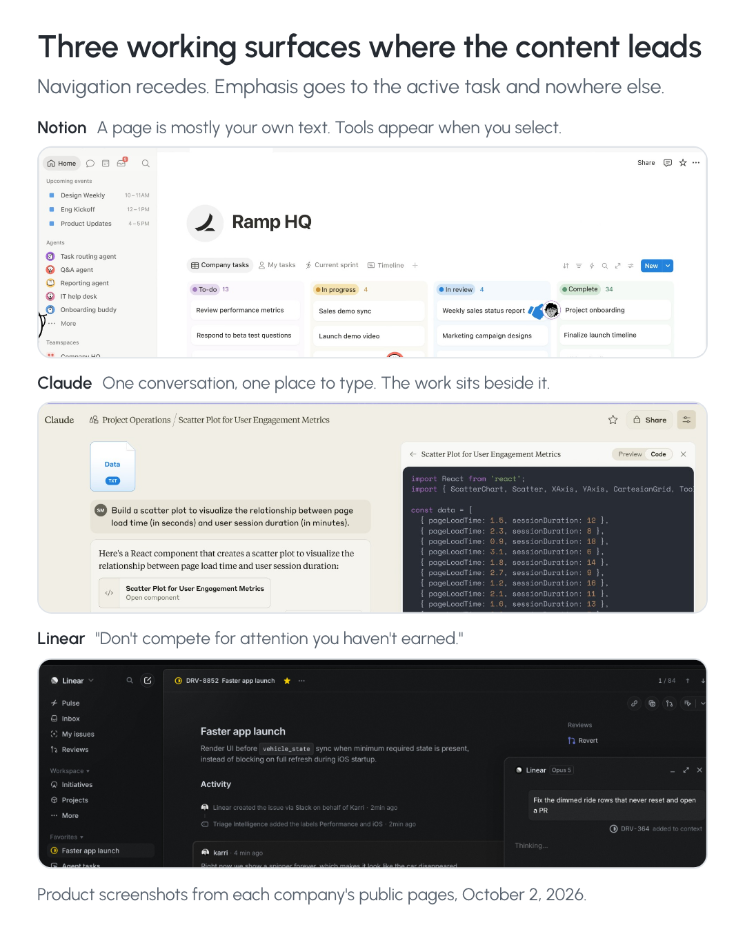
The rule is simple. The thing you are working on stays in focus. Everything that helps you find your way recedes. That rule matters more in a translation platform than in most software, because our screens are dense by nature. Density is not the problem. Density without hierarchy is.
What you will notice
The three screens where you spend your time are live today in the new design.
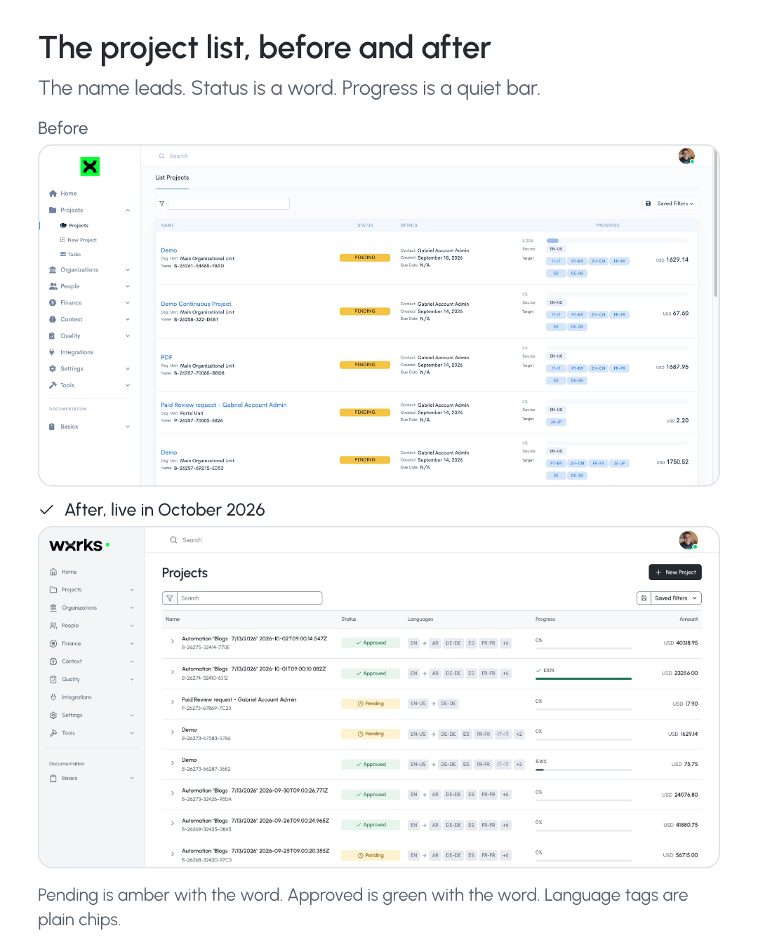
The project list is quieter. The project name leads each row, status is a word you can read rather than a block of color, and progress is a thin bar that turns green only when the work is done.
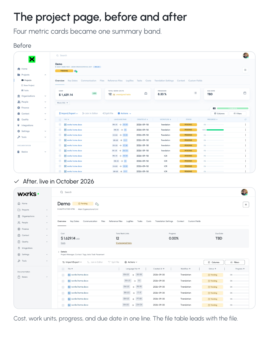
The project page puts cost, work units, progress, and due date in one calm line instead of four competing cards, and the file table leads with the file.
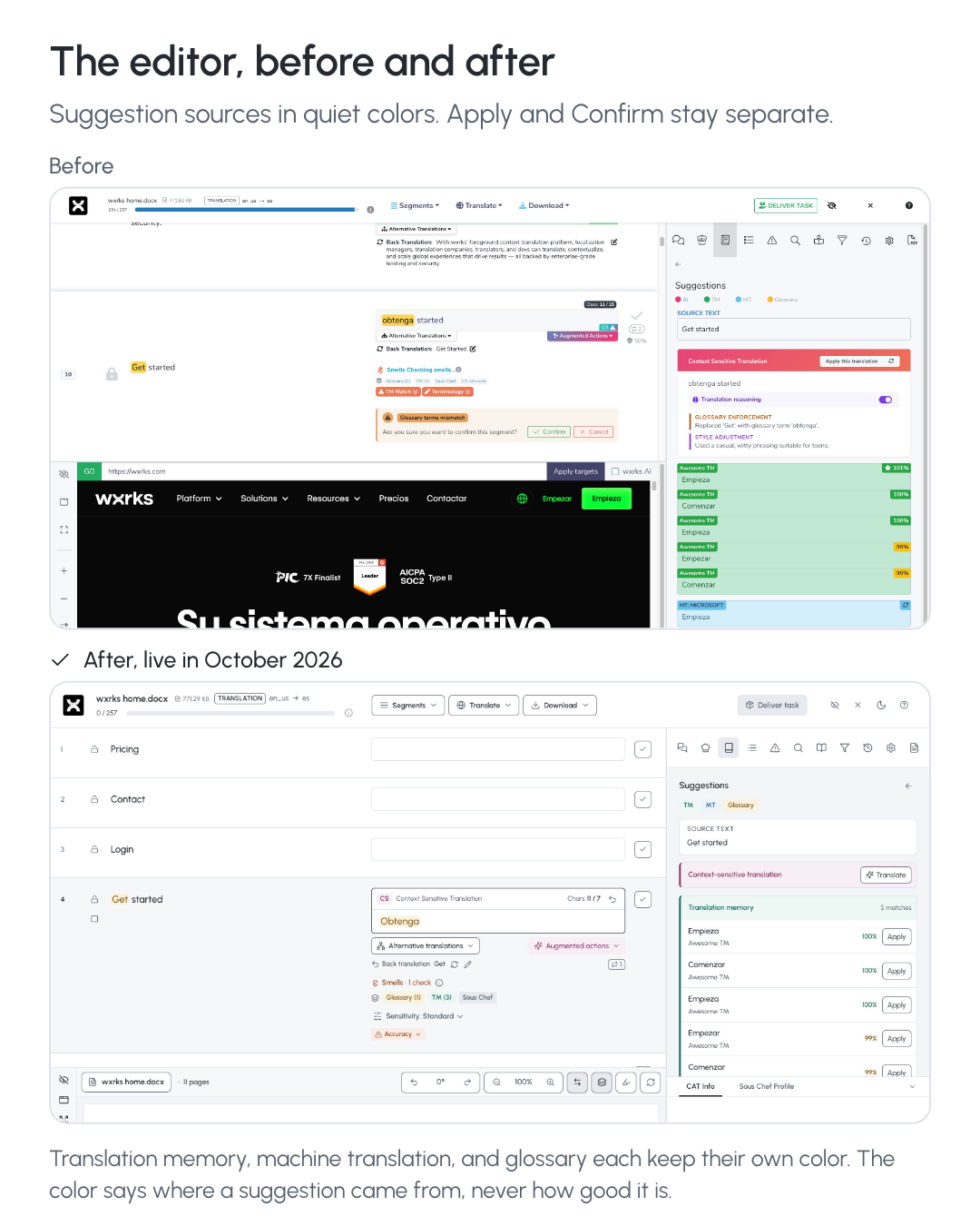
The editor is where the author works, so it got the most care. Every suggestion now shows where it came from, your translation memory, machine translation, the glossary, or the AI, in its own quiet color. The reasoning behind an AI suggestion is there when you want to read it. Applying a suggestion and confirming a segment stay two separate decisions, and that is on purpose.
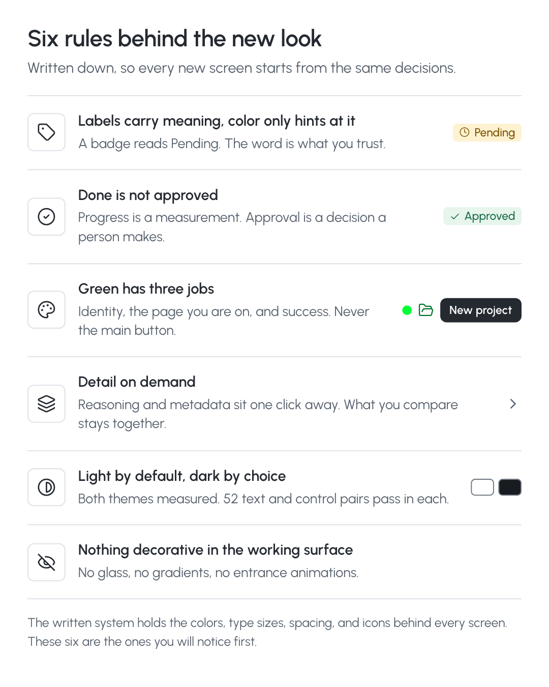
Underneath all of it is one written design system. Every color, type size, and spacing step is a decision we made once, with a reason, so every new screen and every tool we connect next starts from the same place. Six of those rules are in the image below. You do not need to know them. You will feel them.
Why this matters if you run localization
Your screen is the program. For most stakeholders, a localization manager’s screen is the only part of the program they ever see. A calm, consistent one reads as a program under control. A loud one reads as a queue of problems, even when everything is on time.
Reviewers read state correctly. When pending, complete, and approved look different and say so, a reviewer makes fewer wrong calls. That is a governance feature, even if it never appears on a feature list.
Authors stay in flow. Our CEO, Gabriel Fairman, has said it for years. Humans aren’t meant to be in loops, they are meant to be in flow states. The Free-Flow editor was built for that, and a quiet surface is part of it.
The agent era changes what an interface is for. As agents take on more of the mechanical work, the screen stops being the place where every action happens. It becomes the place where the system asks for your attention, or decides not to. We made the same argument about websites in Websites and Translation in the Agent Era. This launch is the same argument about the platform. The machine does the matching and the drudgery. The author decides. The interface makes that division visible and stays out of the way the rest of the time.
Where this goes
This launch is a foundation, not a finish line. Multi-account is coming very soon, so people who work across several wxrks accounts switch between them inside one login instead of signing out and back in. The dark theme is live on the project screens and comes to the editor next. A command palette, one search box for any project or action from the keyboard, is the next prototype. And we will watch real teams work in the new screens before we claim it is faster, because we have not measured that yet.
What we can say today is what the new design is for. It is built to carry the next four years the way the old one carried the last four, with room for every connector, every model, and every person we add along the way. That is how the operating system for global language stays calm as it grows.
Open your projects and the new design is already there. If you are not on wxrks yet, book a demo and we will walk you through it.
Unlock the power of glocalization with our Translation Management System.
Unlock the power of
with our Translation Management System.


.png)
.png)
.png)
.png)
.png)
.png)
.png)